

Stoep Property Co.
A concept website for a fictional independent estate agency selling older homes in Melville, Parkhurst, Linden and Emmarentia, built to show what an agency site can look like when it sells the street as well as the house.
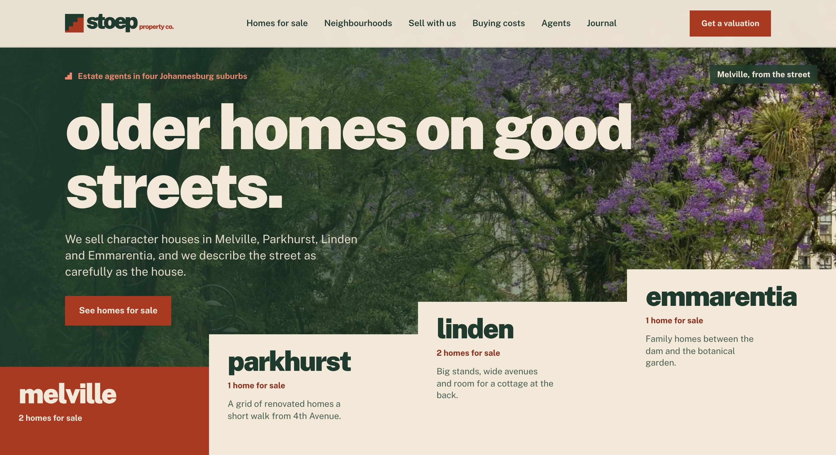
Most estate agency websites look the same: a search bar, a grid of listing cards and a logo with a roof or a key in it. Buyers of older houses want to know what the street is like, what the stoep faces and what it will really cost to move in, and sellers want to know how the agency works and what it charges. Agencies also have to advertise within the Property Practitioners Act: every piece of marketing must say the agency is registered with the PPRA, name each practitioner with their Fidelity Fund Certificate status and capacity, and say whether a trust account is run, and no mandate may be taken before the seller completes the mandatory disclosure form. The brief was to build an agency site with a point of view that looks like nothing else in the market and stays inside those rules.
We built a fast, twenty-six page static Next.js site on the limewash, bottle green and red oxide palette of the logo. The home page opens on a full-screen street with older homes on good streets, and four suburb steps rising across the bottom like the logo: point at one and its street comes up behind the headline, tap it and its guide opens. Below that come homes on the market told as stories, why a stoep, selling drawn as a staircase, the suburb matcher, the agents, the journal and common questions. Homes for sale can be filtered by suburb, price and bedrooms, and each listing has the house, the stoep and the street, the details, the transfer duty at that price, a show day and a private viewing booking. Four neighbourhood guides cover history, the streets to know, the houses, prices and what to think about. A sell page sets out how it works and every cost a seller pays, and three journal articles explain transfer duty in 2026, the mandatory disclosure form and buying an older house. Because the agency is fictional, every listing is labelled as a sample and every booking confirmation says plainly that nothing was sent or stored. The site also includes a POPIA privacy notice, a PPRA notices page, RealEstateAgent, RealEstateListing, Place, Article, FAQPage and breadcrumb schema, security headers and a full sitemap.
- Chose a name with a South African symbol in it: we found no South African agency trading as Stoep Property, and the stoep, where a house meets its street, gave the brand its idea and its logo
- Set out to break our own house style on purpose: an asymmetric mark instead of a symmetrical one, a heavy lowercase wordmark instead of wide-tracked capitals, and a horizontal lockup as the main logo
- Wrote the logo prompt, then rebuilt the approved logo as clean vectors: a square tile split by three equal steps on a 30 unit grid, red oxide like a polished stoep floor below and bottle green above
- Matched the lettering to Public Sans at weights 900 and 800, so the whole site runs on one font family, and took the red, green and limewash palette from the logo with every text colour checked for WCAG AA contrast
- Designed a hero unlike any of our other builds: the street fills the screen, and the logo's staircase becomes the way in, with four suburb steps that rise across the bottom and bring each suburb's street up behind the headline as you point at them
- Carried the staircase through the rest of the site: photos with the corner stepped out to show the red, stepped edges between sections and selling steps drawn as a staircase
- Wrote every listing as a house story with three parts, the house, the stoep and the street, and gave each suburb its own guide researched against current sources
- Built a three-question suburb matcher, a buying costs calculator using the current SARS transfer duty table and the prime rate, and step-by-step viewing and valuation booking that skips Sundays and public holidays
- Wrote all copy within the Property Practitioners Act: PPRA registration, each agent's Fidelity Fund Certificate status and capacity, the trust account statement and the mandatory disclosure form, with no superiority claims or invented sales records
- Added metric-matched fallback fonts so the page does not jump while fonts load, and branded share images for every listing, guide and article
- Custom logo rebuilt as clean vectors, with a full brand kit and a favicon that reads at 16 pixels
- A design system that deliberately breaks from our earlier concept builds: asymmetric mark, lowercase display type, the staircase motif and a hero built around the brand rather than a template
- Buying costs calculator with the current SARS transfer duty table and the prime rate, accepting prices typed as 2.75m or 2 750 000
- Three-question suburb matcher and step-by-step viewing and valuation booking with South African public holidays
- Copy written within the Property Practitioners Act, with PPRA notices on every page and a POPIA privacy notice
- Lighthouse on mobile: 100 for accessibility, best practices and SEO on every page tested, 98 to 100 for performance
- Zero layout shift on mobile and desktop, and no horizontal scrolling on any page from 320 to 1920 pixels wide
- Pure static build with no database, so pages load fast and there is very little to maintain
The concept shows that an estate agency website can have a real point of view and still do the practical work: helping buyers choose a suburb, showing them what a house will really cost and making it easy to book a viewing or a valuation. For a real agency, the same foundation can pull listings from its property management system and send bookings straight to the right agent's calendar or WhatsApp.
Want a similar outcome for your business?
Tell us where you are and we will take it from there.